
A new interface that is image-heavy & on the lines of another social site Pinterest, new Hangouts features, a two column layout….users of social network Google+ were in for a surprise when they logged into their accounts today.
The changes were announced Wednesday on the 1st day of the Google I/O 2013 conference. These include a series of automatic filters and hashtags for your photos
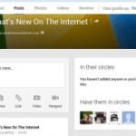
There are 42 updates to Google+, to be added over the coming days. One can say it is like adding some spit and polish to what was once a drab social network, layout-wise. Among the many new things users have to get used to: the left-side nav bar has been moved to the top, and Hangouts are accessible through a green dialogue balloon with white quotes to the upper right.
Your Posts now look like Google Now cards, which fade & flip, & increase in size when you click them. The Share box for creating a new post has been moved to the upper left & is more tighter in design. Hashtags on posts have been moved to the upper right corner, & are also now automatically added to posts, though users still have a choice of adding them to words they want. The search task bar is still on top.
Like any other design change, this one will take time getting used to. But I suspect, the feedback on this one will be positive.
Image Credit: Google+
Advertising Message